


Judging Books By Their Covers
On the art of cover art.

Welcome to what I hope will become a recurring segment on this Substack: a deep dive into some of my all-time favourite book covers. I am an unabashed lover of cover art and will happily buy a book on that basis alone. It’s one of my main reasons for preferring physical books to their digital counterparts. I want to be able to really get lost in the cover art, to hold it right up to my face and take in all of the subtle details, to leave a beautiful book sitting on my desk just to admire how it changes with the changing sunlight.
Cover art is, of course, a marketing tool, but when it’s done well, it can transcend that function and become part of the world of the book. It’s a unique kind of art, comparable to album covers but ever-so-slightly different in its function. Great book covers are not only compelling in their own right, but they also work to prime your imagination to enter the text: a portal to a portal, so to speak.
My favourite book covers tend to have both a transportive quality and an appropriateness to the book’s subject matter and tone. They are images that you can stare at and project yourself into, but they also, through some alchemy of colour and shape and texture, tell you something about the book’s content and style. This magic has fascinated me for as long as I can remember, and I’ve read books that have added incalculable value to my life simply because I was struck by their cover art.
To me, these five covers are all excellent examples of what great cover art can accomplish.
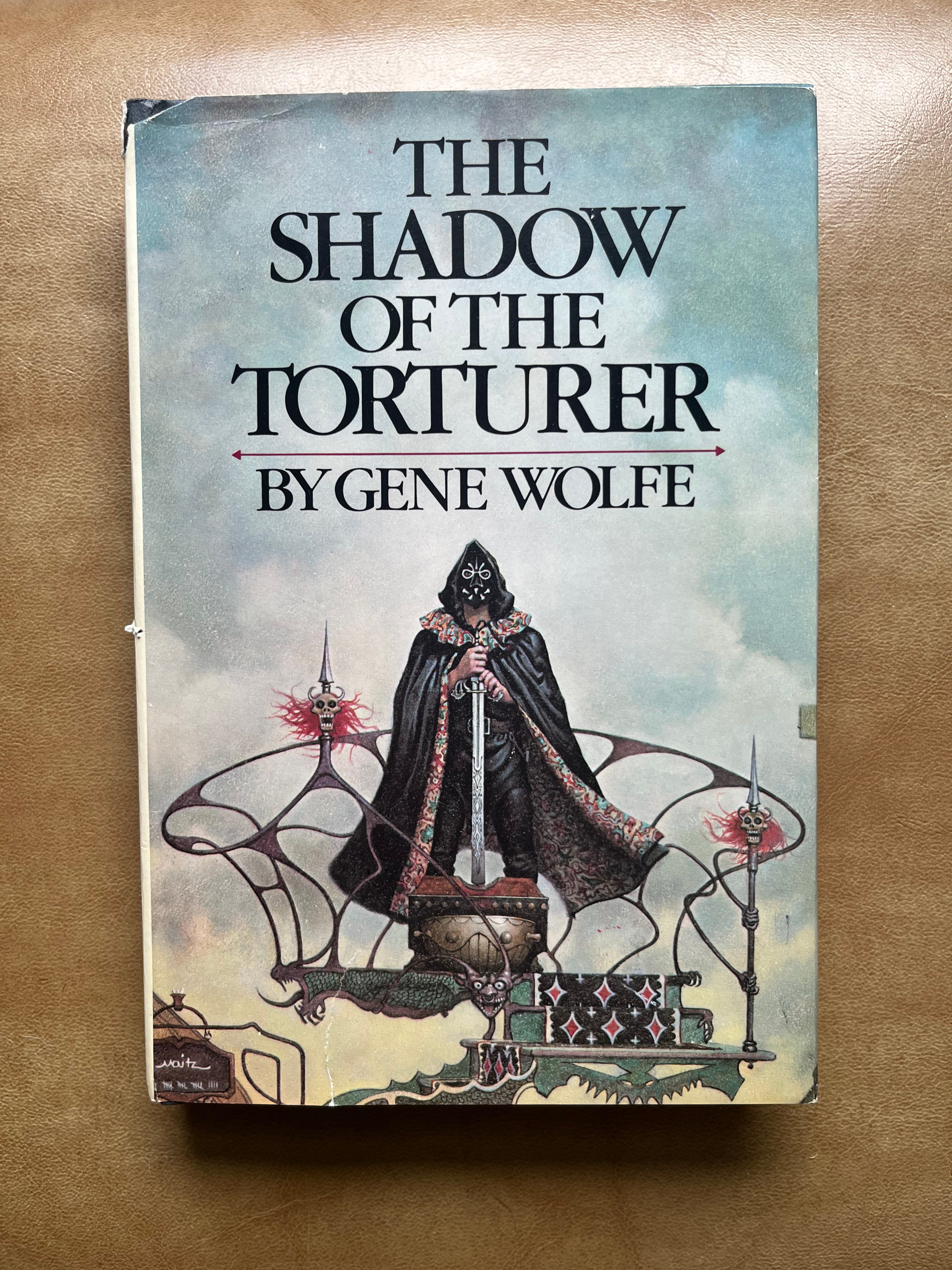
The Shadow of the Torturer - Gene Wolfe.
Art by Don Maitz.
As readers of this list will quickly realize, old-school fantasy novels are overrepresented in my personal canon of cover art. There’s a magical period from the 60s through the 80s during which every fantasy book had either the most incredible cover you have ever seen or was done in such appallingly bad aesthetic (and sometimes moral) taste that you can’t help but be transfixed by it. There is no grey area. Modern fantasy covers tend to be a lot slicker, more polished, and more standardized than the ones from this period, and I haven’t found many that have left a real, lasting impression, for better or worse.
Enter The Shadow of the Torturer. I think my jaw actually dropped when I pulled this off of the shelf at Berry & Peterson books sometime last year. I had heard of Gene Wolfe and the Book of the New Sun tetralogy before finding this copy, but even if I hadn’t, this still would have been an instant, no-brainer purchase.
I don’t even really know where to start with this one. The menace, the drama, the detail. The freakish impaled demon skulls with their wormlike wriggling hair. The way the right horn of the creepy laughing face in the centre of the podium twists up and around to create that sinuous, melty, Dali-esque enclosure while the left one wraps around the platform’s base, which happens to be shaped like a fire-breathing dragon, complete with pale green scales. The black carpet with the red and white diamonds. The splotchy abstract pattern in the lining of the billowing cape. While a lot of fantasy art that goes for a darker, edgier atmosphere can end up looking inadvertently cartoonish, Torturer is a perfect execution (haha) of this style. The whole thing exudes power and threat, and, for me, immediately prompted the all-important response: I need to know what this book is about.
The novel does indeed live up to cover’s promise, though not in the way you might expect. I had assumed it would be a violent, action-packed sword and sorcery tale, but what I got was an overwhelmingly dense puzzle-box narrative that, if the Reddit superfans are to be trusted, usually takes two or three (!) readthroughs before it really starts to click. Still, the prose is often exquisite, and the world—so far into the future that it has regressed to a quasi-medieval state—embodies the surreal and intense atmosphere that makes the cover so instantly compelling. In terms of dark, gritty fantasy art, you simply cannot do better than this.
At The Edge of the World - Lord Dunsany.
Art by Ray Cruz.
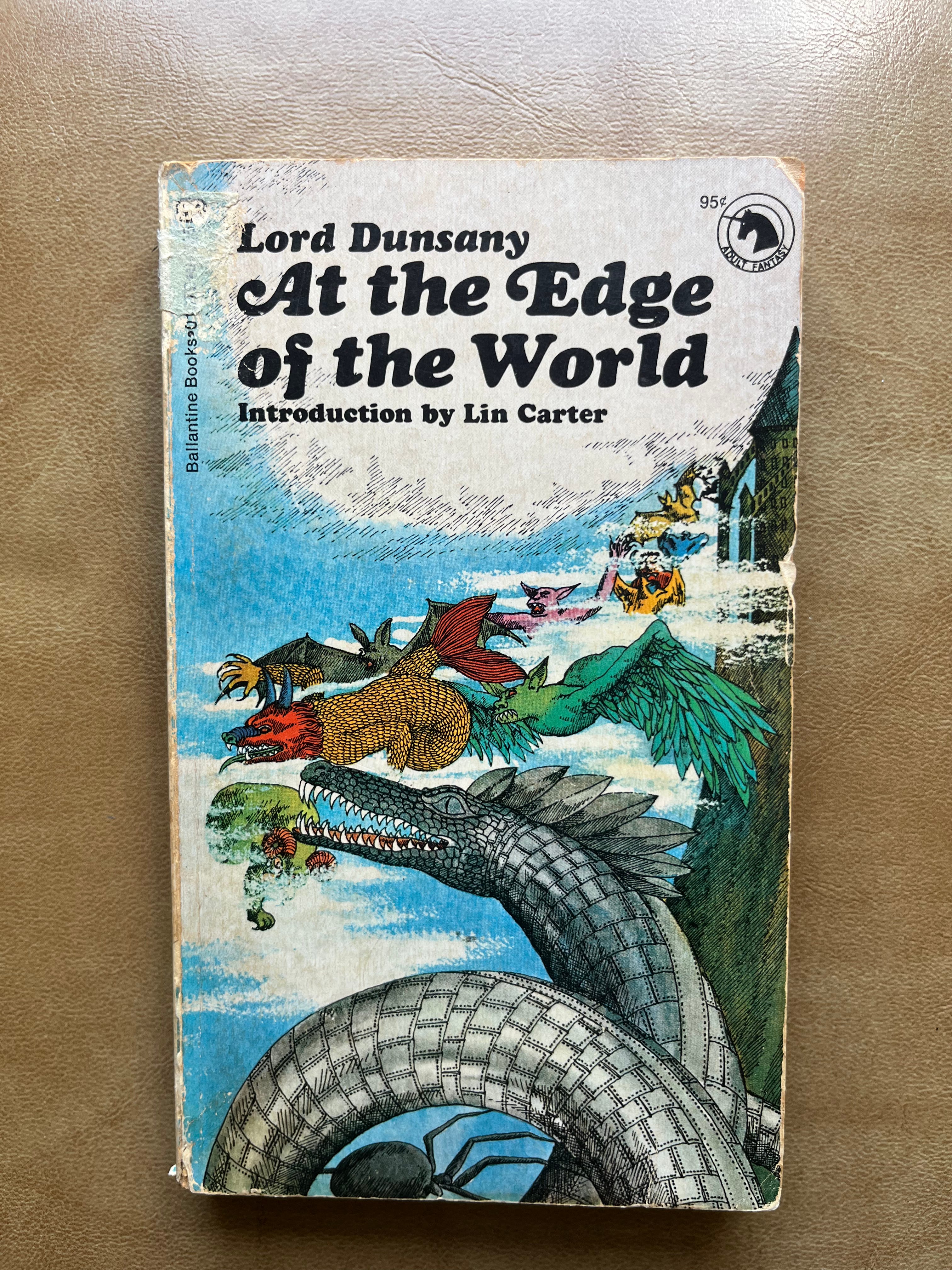
For the next entry, we have a very different kind of fantasy cover. I cannot overstate how much I love this piece of art. Not only are the janky, colourful creatures wheeling out from that distant tower in the clouds a delight to look at in their own right, they are also the perfect distillation of Dunsany’s writing style: inspiration above polish, imagination above all.
There are so many wonderful colours and textures to enjoy here. The yellow scales, the turquoise tongues, the shining metal plates. It’s all so fun and outlandish and inviting, and I don’t think that modern, graphically designed cover art can recreate this kind of feeling. I had trouble corroborating this, but I believe that the Ray Cruz who is credited with painting this cover is the same Ray Cruz who illustrated Alexander and the Terrible, Horrible, No Good, Very Bad Day, as well as a number of other notable children’s books throughout the 70s and 80s. If true, this is an absolutely delightful fact that helps me even more accurately pinpoint what I love so much about this cover.
Dunsany’s stories have always felt to me like children’s stories for adults. I bought this book at 21 or 22 and remember thinking “God, I wish someone had read these to me when I was a kid”. Written before “fantasy” as we know it had calcified into a genre with clearly defined tropes and expectations, these stories read more like fairy tales, myths, or visions. They are pure flights of fancy, filled with strange and inexplicable places, people, and forces that are truly unlike anything else, at least unlike anything else I’ve ever read.
I get goosebumps when I imagine it would be like to stumble onto this book at nine or ten years old, to marvel at this strange, bright cover, then open to the index and see titles like “Erlathdronion”, “Poltarnees, Beholder of Ocean”, and the all-time great “The Fortress Unvanquishable, Save For Sacnoth”, and then to read these stories and be whisked away to the furthest and most glittering regions of Dunsany’s utterly singular imagination. This book, to me, looks and feels like the kind of book that only exists within books, an enchanted tome that you find in an eccentric grandparent’s basement and end up being literally sucked into.
There is a blurb on the inside from W.B. Yeats that reads “Had I read [the story] ‘Idle Days on the Yann’ when I was a boy, I had perhaps been changed . . . and looked to that first reading as the creation of my world.”
Same, Yeats. Same.
The Call of the Sword - Roger Taylor.
Art by Mark Harrison.
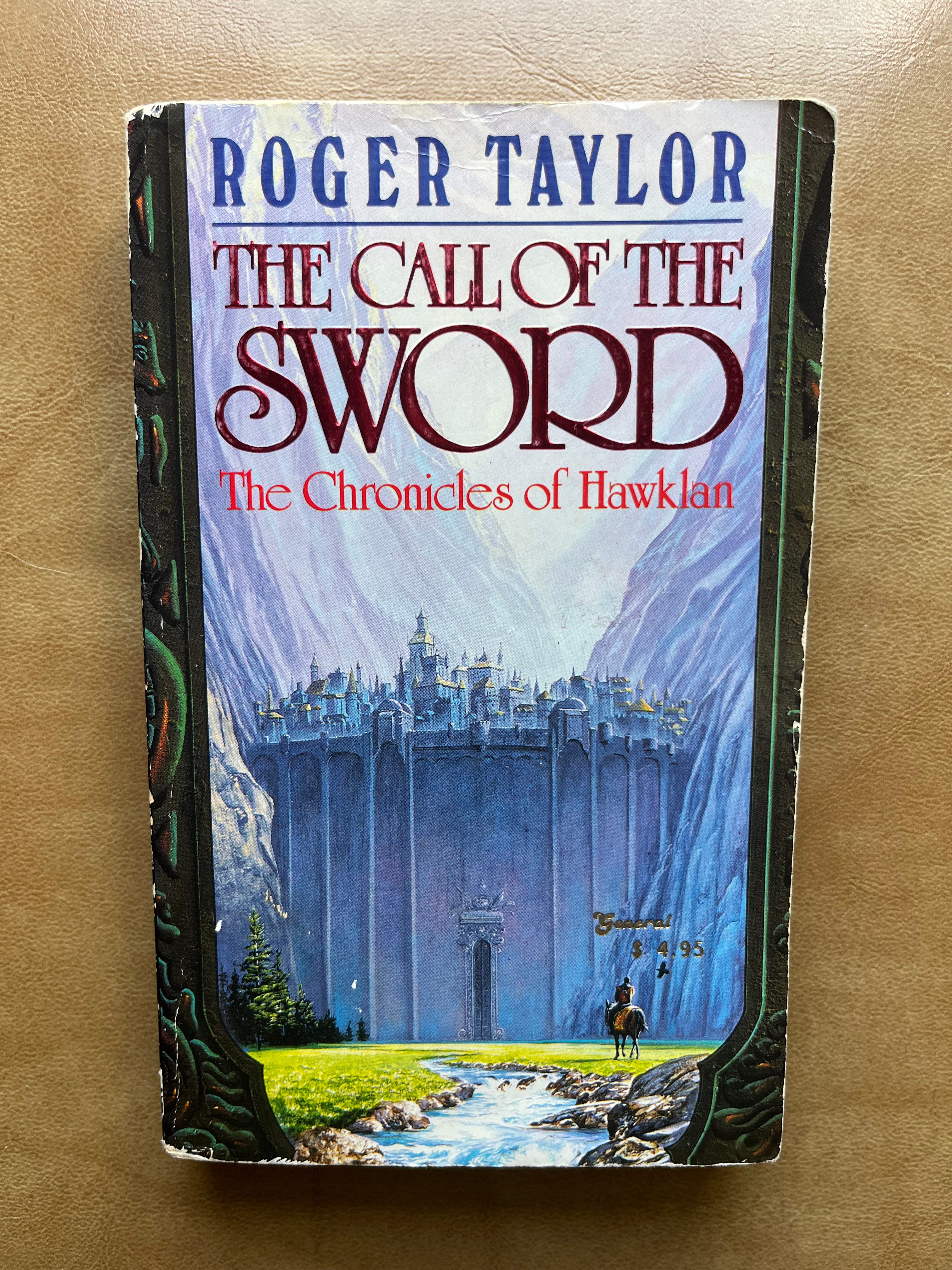
To round out my holy trinity of fantasy covers, I have Roger Taylor’s The Call of the Sword. Before this was one of my favourite book covers, it was one of my favourite album covers: the metal band Summoning used the top half of the painting for their album Minas Morgul, which was on regular rotation during my adolescent marathon walking days. When I eventually learned that the album cover was just a small portion of this stunning book cover, I made it my mission to track down a copy. Every time I went to a new bookstore, I would search the fantasy section for The Call of the Sword.
I did so for almost a decade before finally finding a copy this spring (shoutout Bearly Used Books in Parry Sound).
It was absolutely worth the wait. I love being able to get lost in this image in a way that you simply can’t when staring at it through a computer screen. The colours are so richly, brightly alive that they just call out to me (almost like a certain sword).
If Torturer suggests intense action and Edge of the World embodies fairytale whimsy, Call of the Sword exemplifies a third element of fantasy art and literature: the sense of wonder and grand adventure. It’s a masterful use of scale, inviting the eyes and the imagination to travel upwards and upwards to where the massive mountains dissolve into sky.
Viewed as a whole, it makes a powerful impression, but there are so many lovely details to linger on, like the touches of silvery white that make the grass and water shine, the red and yellow blanket on the traveler’s horse, the ornate patterns on the massive door, the texture of the rocks on the sides of the stream…it really does feel like a window into another world. I can practically feel the wind and sun when I look at it. If I stare at it for long enough, I actually start to feel a very strange kind of sadness, a yearning to stand at the base of that magnificent wall and crane my neck upwards and feel myself be utterly diminished by the vastness of this ancient fortress and the greater vastness of the peaks all around it.
I suppose there’s something childish in that desire to escape to a fantasy land, as if the planet we are lucky enough to live on does not have more than enough sublimity to offer, but I can’t deny the power of the spell this cover casts on me. It brings me right up to the limits of my imagination, and there is something painful in being aware of that limit. It’s like having a snapshot from a dream that I desperately want to remember but will never be able to fully inhabit again. Somehow, it always leads me to start thinking about my own mortality.
Which I guess is all you can really ask for from a book cover.
Valparaiso, Round The Horn - Madeline ffitch.
Art by Jessica Seamans.
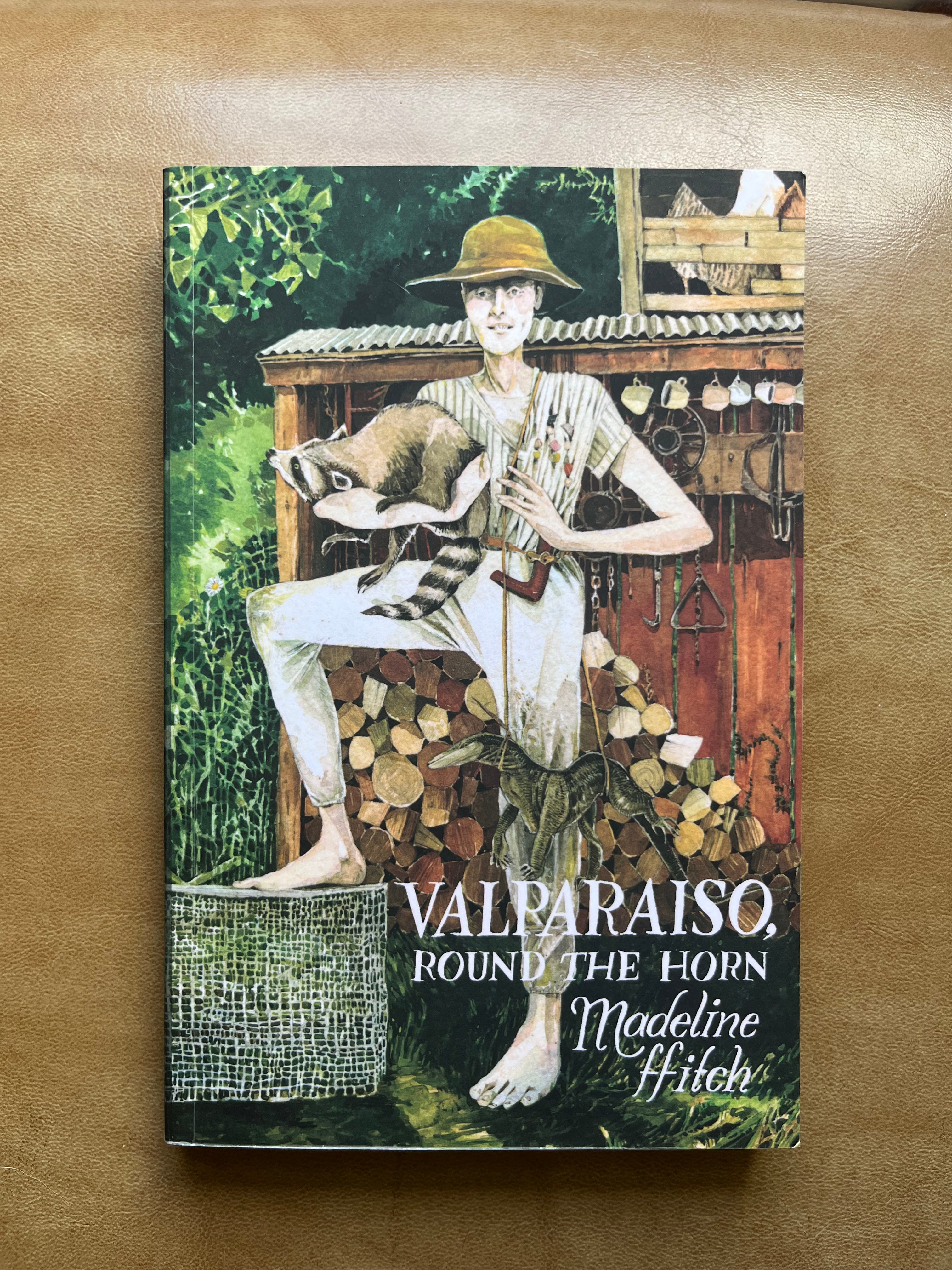
We are officially out of fantasy land, but we are not yet in the “real world”, so to speak. We are in the uncanny, vivid wildness of Madeline ffitch’s Valparaiso, Round the Horn.
This is the short story collection that has had the greatest impact on me so far this year. I hope to write about it more on this blog, so I won’t spend too much time singing its praises now, but ffitch is a poignant writer of neglected places and eccentric outcasts, kind of like a slightly more hopeful Joy Williams. Her stories are arresting and often surreal (I really don’t want to be that guy, but I’m gonna do it, okay, here goes, I am now officially being that guy: they are kind of Lynchian), with sudden outbursts of violence intruding on moments of tenderness and vice versa. Her style is difficult to capture precisely, but this cover does an excellent job of it.
I’m immediately struck by how rich and oversaturated the colours are. This cover is an absolute feast for the eyes. There is no solid green or solid brown: every inch of vegetation or wood is a slightly different shade from the one next to it. The subtle reds and off-whites in the lumber give it a weathered, sun-bleached look, while the mixture of light and dark greens with touches of white and light brown make the grass and leaves feel truly alive. It almost feels too alive, in fact. There’s a flattened, trippy not-quite-realism to it that adds an uncanny edge to its otherwise quite striking beauty.
And then there is the main figure. Androgynous and of unclear age, practically everything about them raises questions. For example, why are they standing in that weird, angular pose? Why do they have what seem to be medals of some kind on the right side of their shirt? What’s up with the racoon and the lizard? Is the racoon trying to escape their grasp? Why does their facial expression look like that? Is it just me or is there something off about the proportions of their right arm and fingers?
If I came upon this scene in real life, I would almost certainly turn and run. Our racoon-hugging(?) friend may turn out to be lovely, they may want nothing more than to pluck down two of those mugs hanging in front of the various sharp metal implements and invite me into their shack for a perfectly pleasant and normal cup of coffee, but the more I look into those eyes the less I feel like I’d be willing to take that chance.
As a scene on a book cover, however, I find it hypnotic, a perfect embodiment of the rugged, off-kilter beauty that makes these stories so unique.
There’s Always This Year – Hanif Abdurraqib.
Photograph by Matt Eich, cover design by Tyler Comrie, art direction by Greg Mollica.
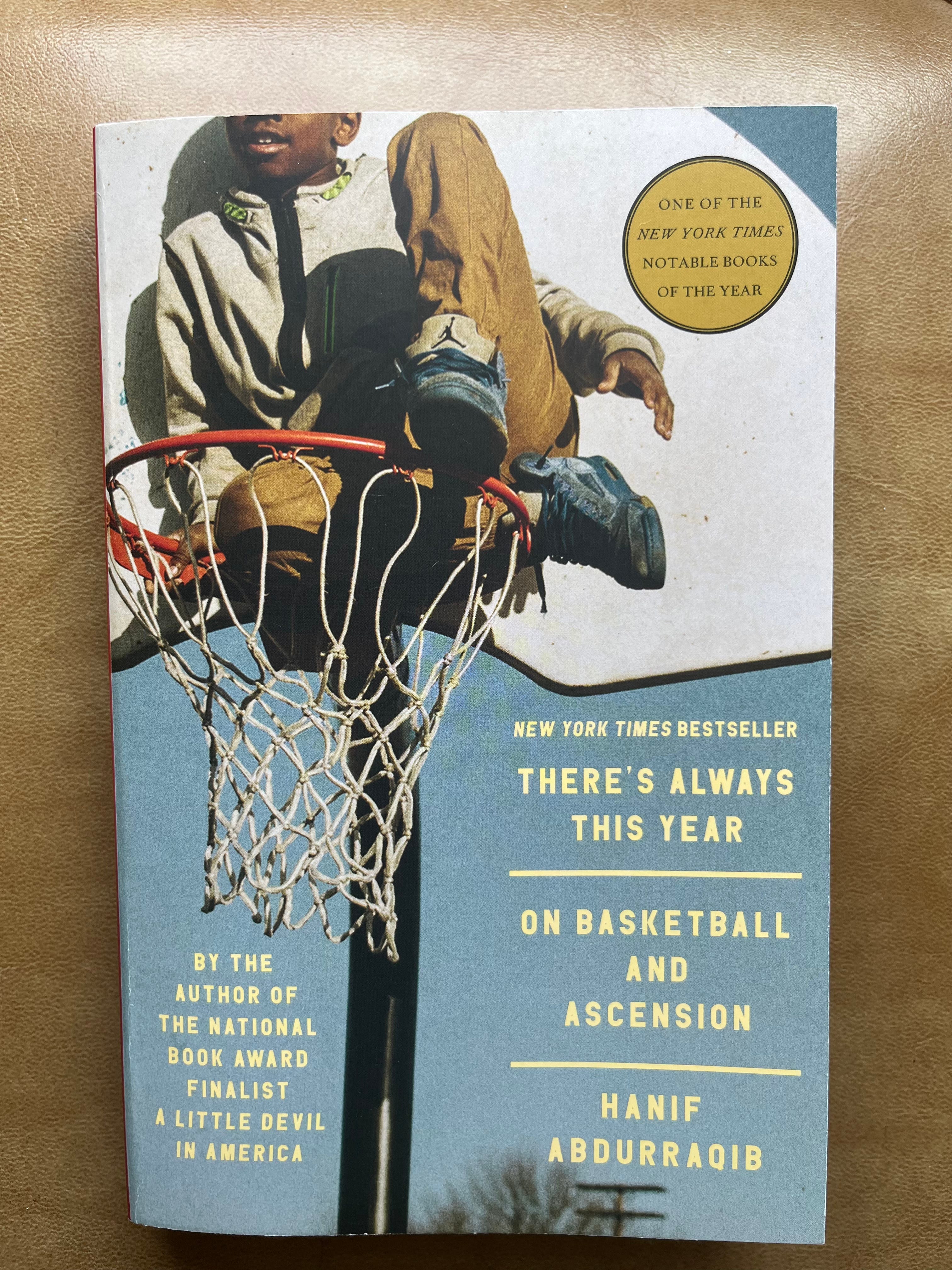
We now come to the lone photograph on the list. As you can probably tell by this point, I have a general bias towards drawn/painted covers as opposed to photographs, and no, I can neither explain nor justify this. If cornered, I would probably say that it has something to do with the way that photographs can sometimes fix a book too firmly in a particular time and place, kind of like how casting choices in movies can overwrite your mental image of a character. I tend to prefer covers that capture a vibe rather than a thing, that invite curiosity and imagination rather than trying to offer a window onto reality.
There’s Always This Year is a perfect counterpoint to this line of thinking. I don’t think it would be possible to paint or draw a more effective encapsulation of these sad yet soaring essays. It’s a little hard to tell through a computer or phone screen, but the image has a warm graininess to it that’s instantly nostalgic, the visual equivalent of a vinyl record’s static. It’s the perfect entry point into Abdurraqib’s wide-ranging reflections on what it meant to come of age in Ohio in the 90’s and early 2000s.
Unlike the Valparaiso cover, there aren’t that many different elements going on, but each one effectively commands attention. I love that soft, hazy, greyish-blue sky, the way it lets you practically feel the still, stifling heat of a summer afternoon on a weed-cracked asphalt court. I love the simple contrast between the black pole and the white net and backboard, with that orange rim providing a vivid band of brightness to break up the overall colour scheme.
And, of course, the star of the image, our avatar of both basketball and ascension. There’s so much I could say about him, but the detail I return to most often is that point near the top left corner where the image cuts off. It’s perfectly placed to make his expression totally ambiguous. I can’t tell if he has the beginnings of a smile or whether his mouth is slightly agape in wonder or shock. Or is this just his resting, neutral expression? I wonder what he’s seeing, what he’s feeling in this moment as he awkwardly steadies himself on a thin steel ring that was not built to support him.
I also love the way his scuffed Jordans echo the colour of the sky. It’s a great little visual metaphor for the book’s explorations of sport, mortality, legacy, and whatever we might mean by “heroes”. As with all of the other covers I’ve discussed in this post, it’s a work of narrative art in its own right.
I love this! I’ve never thought deeply about the cover art of books (although I am now remembering some ones that really pulled me in), so this got me excited to really feel into what book covers communicate to me/how they make me feel before I even open them. This dive in opened me up to this new practice - thank you🙏🏽